They say that the best things come in small packages. Microcopy is one of the greatest proofs of this word’s truth, especially when you want to create a website or an app that provides fantastic user experience.
What is Microcopy?
Microcopy, or widely speaking UX Writing, is one of those UX puzzle elements which can be easily overlooked, yet it’s actually crucial. Let’s imagine that your users are tourists who want to visit an unknown city. This city is your website or app. For somebody who gets there for the first time, it might be difficult to figure out where to go, where to eat and where are the places worth seeing. It would come in handy for them to find a guide. Microcopy is no less but this sort of guiding companion.
Briefly, microcopy is a tiny piece of text in interface that supports the user in taking further steps by comforting, accompanying him and providing with feedback.
Using it well would allow you to show empathy and understanding for your user’s feelings. Would you like to take a short ride and discover a few areas which are pretty good basis for implementing it? Below you will find some juicy examples.
The Journey Begins: Sign-up Forms and New Facilities
Everybody knows the first impression matters. Make sure you say ‘hello!’ to your users in a nice way and invite them to stay longer with you by a catchy sign-up form.
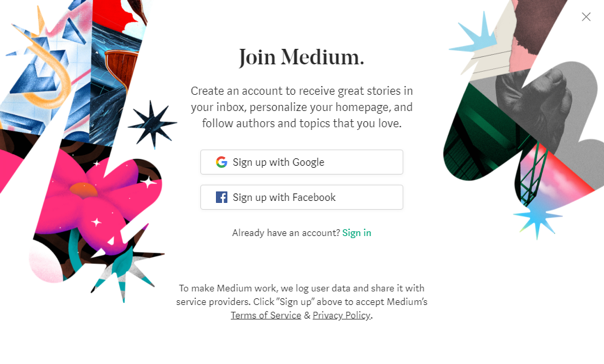
Honestly, registration requires some effort and people usually don’t like it. You have to do all it takes to encourage them to join you. Medium has done a pretty good job in this area. Instead of using a simple title such as Create an account, they say Join Medium. There is a deeper sense behind those words. This is an invitation to the Medium’s community. Then, there we see an explanation on why it’s worth to register: Create an account to receive great stories in your inbox, personalize your homepage, and follow authors and topics that you love.
This a great example of a convincing microcopy which is likely to make users fall in love with the website at first sight.
Did you launch a new brilliant feature in your app? Make sure that your users will get a line on it by sending them a catchy commo. Recently, when Duolingo introduced learning by mini-stories, they invited users to join the famous green owl Duo, then presented how the new learning method looks like in a nice, simple and attractive way:


Problems on the Way: Error Messages & Bugs
Have you ever thought that it is possible to crack a smile when you hit upon the 404 error page? I guess not. Yet, how could you make your users enjoy the 404 nightmare instead of getting frustrated with it? It may sound implausibly weird, but it’s actually a very nice opportunity to stand with your audience.
There are a few solutions to save the day. Pixar’s 404 page is one of the finest examples of using microcopy in a funny and creative way. Bringing into play a hero from the Inside out movie (who’s by the way a personification of sadness) is simply a brilliant idea, isn’t it?

When you’re lost in some strange surroundings, there is no better idea than returning to a safe and well-known place such as a home. Give your users an easy way out of trouble by providing them with a helpful button that can quickly take them back to the home page. That’s what Kiwi.com does when its users somehow end up in… space, instead of the earthly direction they were looking for.

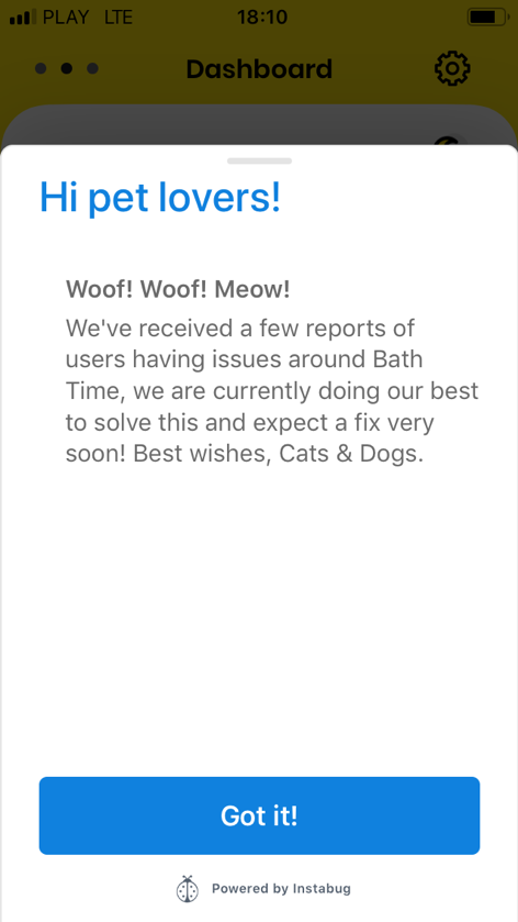
Telling that an error has occurred is not enough. It’s obvious. Assure your users that you’re doing your best to fix it. Cats & Dogs: The Weather App’s creators know how to do this in a pawsome way:
You can also remove a spell from the 404 page or other error pages. What could lift your users up?
Bothersome Questions: Whitelisting Adblocker
There are a few situations when you need to ask your users some questions that could possibly make them somewhat irritated. Asking for whitelisting your website on an adblocker is certainly one of them. If someone is using an adblocker, he won’t be eager to remove it and get bombarded with adds again. You’ll have to make a push to win this time. But if you come up with something creative and charming like the little Bored Panda in trouble…
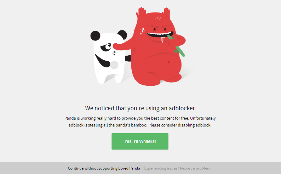
Hmm, that may work! Could you resist to click “Yes, I’ll Whitelist” now?
Time to Say Goodbye: Unsubscribing
Is there any reason to hustle to make an impression on the users who want to leave us anyway? Yes, it is. Remember that they can always come back or change their mind as well. After all, you can only win if you try to keep them longer.
TunnelBear gives an endearing example of using microcopy in this case. When you want to uninstall it you will see a very upset bear. You may stay tough but most probably you will have second thoughts and at least consider clicking on a button ‘Contact a friendly Bear Support’. Because this poor bear is so sad, isn’t it?
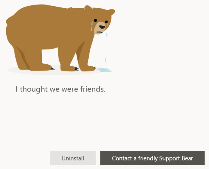
Even if it means the end of your relationship, believe me, showing the users that you’re truly sorry about them quitting is always a positive gesture which will probably pay off in the future.
Microcopy is an Endless Adventure
That’s the end of our short microcopy scenic route. If you enjoyed it, pack your backpack and go for a real adventure with your users!
On each website, there is so much space to experiment with those tiny magic words - such as buttons, signing up for a newsletter, various popups, confirmation messages, waiting time screens, empty states, placeholders and so much more. There are also many well-written articles you can reach for to learn about more wonderful examples, like for instance How to build a better product with UX writing posted on UX Collective.
Also, you can check out the Top 10 UX writing bloopers: No Good, Very Bad UX Writing Mistakes published on Real Big Words blog, so you grasp about how not to make terrible microcopy slips.
To sum up, when creating a microcopy, you have to show that there is a human being on the other side. People aren’t machines and don’t like to be treated as ones or by one of them. So, give your website a human touch by being empathetic. Make your microcopy inconspicuous, self-explanatory and handy. Always keep in mind your user’s needs and pain points.
That’s one of the best ways to get close to your users with the power of microcopy. Have a great journey ahead!


 Angry Nerds (Poland)
 Angry Nerds (USA)
 Angry Nerds (Canada)


